Search This Blog!


Email

Playing with Food

It always seemed like the official party line at mealtime was, “Don’t play with your food!” Well, the times, they are a-changing… A creative movement sweeping across kitchens and social media everywhere lately is food art. By transforming ordinary dishes into extraordinary pictures, many cooks, parents, and artists have been turning each meal into a cultural experience.


With all the beautiful colors and textures found in different kinds of food, it seems quite natural to turn them into art. This makes food preparation an even more creative experience, plus meals become that much more fun to eat!  Bonus: it’s a great way to excite little ones about eating more healthy foods, like fruits and veggies. When the broccoli florets are forming the treetops in a magical forest, it’s a lot tougher to reject them!


You don’t have to be an expert chef to compose clever dishes. Just have fun seeing what picture you can create with what ingredients you have.  It’s more assembly than anything else. You’ll be amazed at what you come up with!


 Food Art by Samantha Lee

Photo via Samantha Lee, Eatzy Bitzy

 Food Art by Idafrosk (Instagram)

Photo by Idafrosk (Instagram), via Handmade Charlotte

 Food Art by bambini_pucillo (Instagram)

Photo by bambini_pucillo (Instagram) via POPSUGAR moms

The gorgeous final products prove that you can be creative just about anywhere. Let the refrigerator be your palette and the plate your canvas!


Have you given food art a try? Would you? Show us your creations!


Print
Posted by , on October 10th, 2013 at 8:54 pm. No Comments

Category: adults,food art,kids Labels: , , , , , , ,


Scribblin’Spiration

As the new school year settles in and everyone begins to adjust to their routines, it seems like a good time for a dose of creative stimulation. With the loss of summer’s freedom, it can be tough to find time for scribbling, but fear not! Your next scribblin’spiration is here and this time it is… autumn leaves!


What better time to embrace the change in seasons and use them for our artistic gain? The beautiful changing foliage is all around you, providing inspiration each day. You might take this inspiration literally and focus on drawing trees and leaves. Go to a local park or look in your backyard for a great landscape sketch. Collect leaves to study, press, or trace. Or use them as a starting point to create something different, abstract, or even unrelated.

Colors of Autumn

photo by Pantone, via Plenty of Colour


The beauty of inspiration is that it can take you anywhere—different qualities of the leaves can stimulate your mind, perhaps even an image or association you have with them may arise.


There are so many elements within changing foliage to find inspiration; one of the most noticeable is certainly color. The rich greens, golds, reds, and oranges create a glowingly warm palette for the season. Try using these hues as a jumping off point for your project or picture.

 Autumn Trees

photo by Corbis, via The Guardian


Another interesting quality of leaves is their shape—each type of tree’s leaves boasts a different figure and you can find all shapes and sizes on the ground. Experiment with the scale and design of leaves to inspire your creation. Also consider large-scale shapes, such as whole trees or forests. How are trees’ shapes affected as the leaves begin to fall?

  Different Autumn Leaves

photo via Fermilab Today


Finally, don’t overlook texture. The green leaves emerge from summer smooth and supple. As autumn advances, those leaves become dry, brittle, and crunchy. Play with surface and touch in your work to explore this element.


What images or ideas to changing leaves bring for you? See how they influence your art all season long. All you have to do is peek outside your window for a dose of inspiration!


Print

Scribblin’Spiration

Time for a new dose of inspiration to get your hands scribbling!

Do you have a sweet tooth? What are your favorite sweets and candies to splurge on? We all have our usual preferences, but did you ever stop and think how wildly diverse candy is? Chocolates, gummies, sour candies, bubblegum, licorice, taffy, lollipops… the list goes on and on!

ChocolatesImage: Wallpy

Peach RingsImage: Dylan’s Candy Bar

That makes it the perfect inspiration for some scribble action. Grab your pencils, crayons, markers, or paints and get ready to explore the sweet world of candy.

The fun thing about sweets is that they’re just as yummy to look at as they are to eat. With bright colors, nifty patterns, and differing shapes and sizes, this sugary snack group is a feast for the eyes as well as the tongue. So it’s no surprise that artists like Wayne Thiebaud and Margaret Morrison find it such a fascinating subject. They focus on extreme detail and texture when creating their incredible still life works.

You can follow these painters’ leads and try your hand at still life sketches of sweet treats or take the inspiration a bit more conceptually.

Three Machines by Wayne Thiebaud
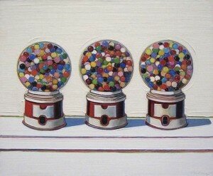
Three Machines (1963) by Wayne Thiebaud, Image: Wikipedia

Gummi Bears by Margaret Morrison 
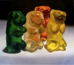
Gummi Bears (2008) by Margaret Morrison, Image: Art Fumes

Let the rainbow of vivid colors, bevy of interesting textures, and myriad of shapes and sizes inspire and inform your scribbling! Pay attention to the labels and packaging… or just focus on what’s inside the wrappers. Perhaps you’ll want to try an extreme close-up of a sour gummy worm’s texture, or a collage of your favorite treats, or even something totally abstract yet inspired by the elements of candy. Draw what you think a certain candy tastes like. Or use the color scheme of certain brand or flavor to create a picture.

Assorted CandyImage: Sparknotes

 Enjoy your extra-sweet scribbling treat! What’s your favorite kind of candy?

Print
Posted by , on July 12th, 2013 at 9:32 pm. No Comments

Category: adults,Arts & Crafts,food art,kids Labels: , , , , , ,


Scribble Artist Interview with Yulia Brodskaya!

Scribble Town (ST): Yulia is everywhere!  We first discovered her while flipping through an Oprah magazine and then saw her work featured in Material World: The Modern Craft Bible.  Yulia is an expert paper artist and is generous to share her tips!  Where are you and what are you up to these days?

Yulia Brodskaya (YB): I live close to London, very busy with my paper art and two little kids.

M Real by Yulia Brodskaya

M Real by Yulia Brodskaya

ST: I have never seen anything like your art.  How would you define your work?  It seems to be a peaceful combination of craft and fine art.

YB: I just call them paper artworks; but I don’t normally try to put any labels such as craft or fine art or even focusing on the term ‘quilling’ too much. I use a combination of paper manipulation techniques to create my paper artworks.

Jungle Bird by Yulia Brodskaya

Jungle Bird by Yulia Brodskaya

ST: How did you discover this artistic process of creating paper artworks?  Was there somebody that encouraged you?  With your two kids perhaps they help with the playful aspect of your images!  Your birds and butterflies look like they will just fly away.

YB: I always had a special fascination for paper, I’ve tried many different methods and techniques of working with paper, for instance Origami, paper collages, however Quilling technique turned out to be ‘the one’ for me. I started to use it about five years ago: I was planning to create a small brochure with my hand-drawn illustrations to be sent out to potential clients and I was looking for an eye-catching image with my name ‘Yulia’ for the cover. I created a number of hand-drawn variants, but I didn’t like any of them and then I remembered an image from some school book showing a paper strips standing on edge, so tried to make the letters using this technique and apparently the attempt was successful; over the next couple months I switched to paper illustration completely.

Nature by Yulia Brodskaya

Nature by Yulia Brodskaya

ST: Through playing and dabbling we just stumble upon what we didn’t expect! Where do you find yourself feeling really inspired to create?

YB: In my little studio.

ST: How do you manipulate your paper? What is the process?

YB: I use cocktail straw and little cocktail sticks for rolling the paper strips (I didn’t know that there are specially designed tools available when I taught myself to shape the paper strips, I started to use the cocktail straw and I still use it now). Also, scissors, twisters for little details, glue and of course paper paper paper. For the process the best thing will be to search for some basic youtube lessons.

ST: Yup, anything can be a helpful tool especially when you know what your aim is.  Cocktail straws do the trick!  Yulia, any tips for our scribblers out there?

YB: Just have fun with it; it will be a pleasure if you enjoy it. The process is very slow and time-consuming so if you are not enjoying it the whole experience can be a plain torture.  I have a fish pattern that I designed for my workshop in Shanghai, it is very simple, people can use it as a basis for the quilling experiments.

ST: Thanks Yulia!  I’m going to give it a try!

Pure by Yulia Brodskaya

Pure by Yulia Brodskaya

Print

Scribble Artist Interview with Doris Sampson!

Scribble Town (ST): Here with us on the Scribble Blog is Doris Sampson!  Doris is an artist full of energy, stories, creativity, and much much more as you will soon find out.  Doris, where are you and what are you up to these days?

See how I found shoes in this drawing? Added eyes to create a shy guy asking for a dance.

See how I found shoes in this drawing? Added eyes to create a shy guy asking for a dance.

Doris Sampson (DS): I live in Duluth, Minnesota . . . U.S.A.  This city is located at the western-most tip of Lake Superior, the largest of the Great Lakes.  It’s awesome!  Like living on the shore of an ocean, from our shore we cannot see land on the eastern horizon.  Weather events can rile up some terrible storms, occasionally over even modern decades taking a freighter to the bottom of any one of the Great Lakes.  The Big Lake is also our natural air conditioner.  Because the temperature of the lake is always much cooler than the air, when we get a wind off the lake, Duluth can be significantly cooler as we’re situated in the valley of a big hill alongside the shore.  Over the hill, much warmer!  I like it this way because I’m no fan of hot weather!

DS: My career as an Artist spans 48 years, and I started Photography shortly after that, too.  I’ve put tons of time and money into taking pictures, and since starting digital in 2002, in total over all my years, have tens and tens of thousands of pictures.  Therefore, big chunks of time have gone into organizing those photos and since digital can fix OLD photos, in recent years lots of time has gone into restoring many, many photos from family albums covering  my Finnish-American family heritage and history.  I eventually will produce books about my personal memoir and probable historic photo books.  I’ve also been a writer, starting with journaling at the end of 1977.  I absolutely love writing, and my computer storage now contains working manuscripts for at least a dozen book concepts, with other ideas piling up behind those.  But I need to update my computer equipment soon so I can better format manuscripts, and art/photos into them, too, to prepare them for electronic self-publishing.  I love that option we have now!

The shape looked like a golf club, though wildly abstract!

The shape looked like a golf club, though wildly abstract!

ST: When did you start drawing and painting?

DS: As a child I was already a natural artist.  I believe it was genetic as I’m 100% Finnish lineage–and the Finns are genetically extremely artistic.  I loved doing art as a child, all the way through school to graduation.  Because my family was farmer-laborer, I didn’t go to college for higher education–but was smart enough to have done that if there had been money.  Instead, I never sat back on the learning process as a young adult–in any subject.  But rather quickly did return to art . . . painting . . . about 5 years after graduation.  I had two pre-school daughters by then, and began painting on the kitchen table–of course, needing to clean up scrupulously after each session!  Especially because I’d started with oil paints–eventually switching to acrylics to avoid the fumes and possible other contact-toxins from handling oil paints.  Especially Flake White, which has lead.

ST: Was there somebody that encouraged you?

DS: Yes, there was someone who inspired me as an artist starting from a very young age.  Actually, my mother had painted as a teenager with a friend whose name was Marion.  So it was seeing as a child craft pieces my mother had made so many years before by gluing fall leaves on the then-78rpm records.   And then painting the leaves yellows, oranges, reds.  There were three paintings my mother had done that still exist to today.  So those were always on display in my grandparents’ farmhouse in Northern Minnesota.  My father had also been artistic, and had begun art school when they lived in Detroit–I was born in a suburb, Ferndale, at that time.  But he was drafted into World War II and had to quit art school.  Only one drawing my dad did, of the violin maker, Stradevarius, existed then, and to date.  It’s framed and hanging on a wall in my sister’s apartment here in Duluth.  Neither of my parents  were able to follow art as adults.  My mom was a homemaker and my dad a laborer.  Thank God he returned home from the war with just some back problems from a glider crash.  He was in the Battle of the Bulge in the 101st Airborne Division–a terrible event during WWII.

Here is a scribble drawing that reveals a woman by how I filled in spaces with black ink.

Here is a scribble drawing that reveals a woman by how I filled in spaces with black ink.

Marion, as Mom’s girlhood friend since kindergarten (or maybe it was first grade then–did they have kindergarten so very long ago?) . . . was still her friend as I was growing up, and we’d visit her home in that rural area near my grandparents’ farm on occasion.  Marion had taken up painting during her adult  years, but did extremely few in total that I know of.  One was a stunning portrait of a sister who had passed away, painted ethereally in blues, like the sky, her imagery as of angels.  Riveting to me!  Then, I believe this was after I was an adult with a toddler, as I recall one specific visit with my mom to Marion’s, with my daughter; she showed us another painting more recently done . . . a Moose in a Northern Minnesota swamp, edged with the typical swamp spruce and tamarac forest–a beautiful fall scene that I can see in my mind’s eye still.  Marion was so special to me and I just soaked up her artist-ness into my soul!

This mushroom shape becomes one with some embellishment; not the different pen strokes creating varieties of texture.

This mushroom shape becomes one with some embellishment; not the different pen strokes creating varieties of texture.

My family was always supportive of my love of art and Nature as a child.  I would do Paint-by-Number sets, and, again, I loved art in school.  I would save my artworks and when several aunts and uncles came visiting from Detroit and Florida to Minnesota in the summers, I’d bring out those drawings and paintings to put on an ‘exhibit’ . . . and they’d give me a dollar!  Guess what . . . I still have my best, saved artwork from the first dated to when I was 11 years old, through the 7th, 8th and 9th grades of junior high school!  They can be seen on my website:  dorissampson-lenscanvas.smugmug.com !  For so long I’ve wanted to be an inspiration to children, and here is my first opportunity!

ST: I bet you have been an inspiration to children even when you didn’t mean to be one.  I’m impressed with you range of techniques! You even have collage and modeling pasted paintings.  How did you discover and use this technique?

DS: I don’t remember right now what started the collage/modeling paste paintings.  Since I’ve kept good records throughout my art career, it’s probably written down somewhere for me to find when I can start digging.  But they were fun to do, using materials to build a foundation for a painting; then gessoing that ground (a primer layer); finally painting everything.  Then, give it a wash of diluted burnt umber (brown) acrylic paint mixed in a lot of water and quickly wipe it off again with a soft rag–before it could dry.  Then only a little bit of pigment would remain on the surface of the painting to provide a slight antiquey appearance to it.

ST: How do you handle moments when you get a zoom of inspiration?

DS: Since I do Art, Photography AND Writing, inspiration is more or less a constant on-going thing of which I can never keep up; as much as I would like to.  So Art ideas get noted on paper, some started; Photos are a never ending job in my computer now; and my external hard drive is exploding with accumulated Writing projects, or notes and notes and more notes for those underway, and new project ideas.  What I work on from day to day has no schedule–except to plow into whatever project/s are staring me in the face . . . NOW.

Color can be dropped into a drawing as desired on a computer, for me this was done in Photoshop4.

Color can be dropped into a drawing as desired on a computer, for me this was done in Photoshop4.

ST: What other forms of art do you practice?  What are some tools you like to use to create?

DS: Art, Photgraphy and Writing take up all my work time creativeness.  However, I am a ballroom dancer, and good at it.  Genetic I’m sure as both my parents loved to dance and were great dancers in their early years.  Raising a family, I only saw them dance about three times that I can remember.  I sure wish I could see a movie of the years I was never a conscious part of!  Dance  is a wonderful, beautiful and happy form of Art!

ST: How do you find you models for your pen and ink drawings? There must be hundreds of beautiful portraits!

Here I wanted to make a heart shape with abstractions--a very fast swish, swish, swish with the hand kind of drawing.

Here I wanted to make a heart shape with abstractions–a very fast swish, swish, swish with the hand kind of drawing.

DS: A couple of the people and pet pen and ink drawings you see are ones I did because I wanted to do them for myself.  The rest are commissions from folks who saw my first portrait promotions starting around 2002.  What you see in my website are what I’ve done.  There might be another couple or so not shown, but I can’t remember at this writing.

ST: I’m sure there must be many, but what is one of your favorite songs?

DS: It’s probably better to ask what are my favorite genres of music.  I love Finnish music that depicts my era of growing up–accordian and fiddle bands.  There are two in particular I have tapes or CD’s of; Minnesota bands, “Third Generation” and “The Finn Hall Band”.  Next, whenever I have an opportunity to work in my office AND listen to music at the same time, I’ll put on internet radio with Pandora.com . . . and I’m already keyed in to Classic Country-Bluegrass Gospel songs by historic Nashville voices from yesteryear to current singers who still have the same classic sound.  On Sunday mornings, we have a local radio station, WKLK, that also plays those old gospel songs.  I absolutely love them, and they are my inner Church every time I listen to them; filling me with the Spirit of God!

I also enjoy classical music on occasion; and my everyday favorite genre is the current “Music of Your Life” station that is streamed via many radio stations across America.  Those songs truly depict the best pop songs I’ve heard over my 70 years of lifetime!  So it would be more correct to speak of favorites in each genre–but that would be too big a project to do!

ST: Your art career has taken you on such a journey!

DS: I started my Scribble Drawings, which I now call my “Human Emotional & Thematic Caricatures . . . or Just Pure Art Form”, when I was taking drawing classes at a local university in 1985.

Do you see how you can add human emotion to a drawing than can be transformed into a man by adding teeth, an eye and a hat!?

Do you see how you can add human emotion to a drawing than can be transformed into a man by adding teeth, an eye and a hat!?

University art classes were already far into the “modern” thing . . . be loose, let your mind wander, and finally . . . just scribble and see what happens.  Well, I absolutely LOVED what I did with scribbles, learning immediately that the most important thing to remember is . . . WHEN TO QUIT!  My personal take on it was to use quality pen and ink, and then take a good look at the scribbles to see if or what there was anything recognizable in the shapes.  If so, then I’d start filling in space with my black ink to bring out that ‘something’ . . . or ‘someone’, if it had an abstract human element to it.  Other times the shapes and forms depicted only abstract shapes and forms!  So then I filled spaces in while keeping COMPOSITION in mind; to create Pure Art Form.

I did a large number of them around 1985, and it was the year 2000 when I took it up again.  I was working on a book of poems about the subject of “Love” as a “mystery”.  I wanted to illustrate the book and it occurred to me those 1985 drawings could be termed mysterious.  When I checked them out, I discovered that many of my poems actually matched what some of the drawings seemed to be displaying.  So I included them into my manuscript, and started doing the scribble drawings again here and there until now.  I have about 250 of them now!  These can be seen on my website also:  dorissampson-lenscanvas.smugmug.com.  Find this gallery under ART OF DORIS SAMPSON.

ST: Doris, thank you so much for sharing with us! You have shown us how to look at life, lines, and color in a different way with your creative scribbles!  If you have any tips for parents and adults for how to create with children please let us know.

This drawing shape clearly resembled a pumpkin, so I gave it color and an abstracty kind of face!

This drawing shape clearly resembled a pumpkin, so I gave it color and an abstracty kind of face!

DS: As for tips for parents, EVERY CHILD IS AN ARTIST!  Provide the materials for them, and they will draw and/or paint.  Display the Artworks.  Choose the best from every year’s work and place these into an archival album–learn HOW to preserve art and photos archivally, don’t just glue or tape them in.  There are album stores all over the country now.  There is one online source I’ve been able to get oversize albums from in which to store my Scribble Drawings.  It used to be called Century Plastics . . . don’t know if that’s a current name or not.  These albums were acid-free, as I recall, with 12×18 pages of sturdy paper.  A perfect ground for archiving your children’s artworks.  The best of the best artwork/s–mat and frame them!  I have some from my daughters.  Once, when her dad and I went to a conference night, there were pastel painting pictures hanging all around the room–one by each child in that class.  My eyes flew to one in particular that clearly shouted, “This child IS an Artist inside already!”  It was so good compositionally, and with colors, lines, shapes and forms!  Well . . . it was my daughter’s . . . a chip off the old block, going all the way back to both of her grandparents’ generation, too!

This daughter is now an assistant professor in the Art Department of a University in the State of Missouri!  My other daughter is a Certified Public Accountant; and far on her way, too, of becoming a Nutritionist . . . already, via the internet, she is teaching people how to live and eat NATURALLY.  That was something else our family did–we gardened organically, I canned and froze vegetables and fruits; and by golly, both grew up to follow in those footsteps.  The Artist of my two daughters, and her husband, own an organic farm and apple orchard in Missouri!

ST: You are right, Doris, every child is an artist.  Thank you :)

Try these two Scribble Inspirations from Doris Sampson:
‘Yellow roses for my birthday’ and ‘Collage painting art project’

Ultimately I elaborated on the original (displayed above) by adding red and blue for a patriotic statement, "I Love America!" This is a wonderful example of how and why I plan to produce a line of products, such as greeting cards, from my drawings!

Ultimately I elaborated on the original (displayed above) by adding red and blue for a patriotic statement, “I Love America!” This is a wonderful example of how and why I plan to produce a line of products, such as greeting cards, from my drawings!

All photos: Copyright Doris Sampson 2013.  Permission for free educational use for children granted.  All Artist Reproduction-Distribution Rights Reserved. Contact Information:  “.  Feedback to Artist is welcome!”

Print

Scribble Artist Interview with Chelsea Waite!

Scribble Town (ST):  Every year, Youth Art Month (YAM) has a flag competition for each state.  Students from each grade level (elementary, middle, high school) creates a flag design for YAM in their state.  The design can use the National theme: Art Shapes the World, or you can create your own theme.  A winner will be chosen from the three levels and the winning flags will be represented on the posters and postcards promoting the YAM show at the Capitol in March.  The winning student artist will receive an actual 3’x5’ flag of their winning design.  On the Scribble Blog with us is the winning high school student from Minnesota, Chelsea Waite!

Chelsea Waite's winning NM YAM flag!

Chelsea Waite’s winning NM YAM flag!

Chelsea, what was your first thought when you heard of the YAM project?

Chelsea Waite (CW): When I first heard of the contest, I was excited because I have never been involved in a art contest this big before.

ST: Already you sound like a person who is up for challenges and like to take a chance! How did your idea develop?  What story or idea are you trying to convey with your flag?

CW: I wanted to focus on the idea of diversity. I think diversity is important to New Mexico because of the many different cultures we have here. My first idea of how to represent diversity is in using the Zia symbol. I found that I could manipulate the ends of the symbol to go off into different direction, but then come together in the middle to make one complete symbol. This is how I think the people of New Mexico are, we come from lots of different cultures but live together as one.

ST: Multiculturalism in New Mexico is just one of the things that makes it a special place. :) How did you decide what medium to use?

CW: I decided that I would use Sharpie and color pencils because it is easy to make small thin lines with these mediums.

ST: How do you feel about your final outcome?

CW: I was happy with my final outcome, but I never thought it would win.

ST: And that’s exactly what happened! What do you like most about your YAM flag?

CW: My favorite element in my flag are the yucca flowers. I didn’t choose the yucca flower because it is our state flower, I chose it because it is not very pretty. Compared to the millions of flowers in the world, the yucca flower is ugly but if you look close enough there is beauty there. I think this represents New Mexico because of that very same reason. This state is often overlooked but if people take the time to look close enough they will be able to see beauty.

ST: That’s such an honest approach to depicting your surrounding.  There is beauty everywhere if we just tune our eyes in the right way.  You are so wise and thoughtful!  How did the idea come into your head?

CW: I came up with the idea the moment I heard about the contest. The idea popped into my head very easily and with not much effort.

ST: And just like that we now have a beautiful YAM flag for New Mexico! Thank you Chelsea for your creativity and taking the time to share with the Scribblers!

Print

Scribblin’Spiration

Yesterday, I went to the movies and saw To The Wonder, directed by Terrence Malick (Tree of Life, Days of Heaven). Malick is probably best known for his gorgeous cinematic poetry. He uses beautiful camerawork to showcase the natural beauty of our world (and sometimes our destruction of it). One element of nature that he seemed to really focus on in this movie was water. Oceans, puddles, rivers, indoor pools—this film was swimming in shots of water, each more beautiful than the last.

Still from To the Wonder (2012)To the Wonder (2012) – photo still

As I watched this visual theme develop, I started thinking about taking it beyond the theater with me, which makes it our new Scribblin’spiration! Water can take on so many forms and appearances. Sometimes it looks blue or green or gray… other times it’s clear. From far away, it seems opaque, while up close it’s transparent and can distort whatever you’re seeing through it. It can be in a natural body, like an ocean or river, or it can be in a pool. It could be running from a faucet or waterfall, or just sitting in a glass. Sometimes it’s still and tranquil while other times it’s rough and choppy. And that’s just in its liquid state! Don’t forget ice, steam, and fog! But for now, let’s focus on liquid. While seeing water is a pretty common occurrence, it still makes a fascinating subject for art.


Now it’s your turn. Try out your own artistic interpretations of water by observing a couple different examples. Go out to nearby river or pond. Take along a sketchbook on a trip to the beach. Check out some puddles after a rainstorm or just fill up a glass of water. Try working with pencil, pastels, paint, and watercolors. See how each medium changes the way the water looks and the mood of your picture.


Here are some artists’ own interpretations to give you an idea of how different water can look from one painting to the next. Have fun experimenting and don’t forget to share a link to your work with us!

Starry Night Over the Rhone (1888), Vincent Van GoghStarry Night Over the Rhone (1888), Vincent Van Gogh

Portrait of Artist (Pool with Two Figures) (1971), David HockneyPortrait of Artist (Pool with Two Figures) (1971), David Hockney

Lemon Water (2010), Debbie Becks CooperLemon Water (2010), Debbie Becks Cooper


Print
Posted by , on May 4th, 2013 at 2:31 pm. No Comments

Category: adults,kids Labels: , , , , ,


Scribble Artist Interview with Amy Eisenfeld Genser!

Scribble Town (ST): From a distance what looks like a beautiful volcano of color and texture turns out to be an ingenious technique of rolled paper and paint. Amy Eisenfeld Genser has mastered the art of creating an organic effect by using mixed-media. Amy is also a mom of three sons from West Hartford, CT.  She says, “I’m a tad obsessed with paper and paint, color, patterns, and texture.”  You’ll soon see why!

Let’s start with, what does a day look like for you?

Mineral Long Pink by Amy Genser

Amy Eisenfeld Genser (AEG): I am usually in my studio, on the third floor of my home. I work about five hours a day while my kids are in school. It is a juggling act. My typical day is to get the kids off to school, hit the gym for an hour, and then come home to work. Because my studio is in my home, it’s sometimes hard not to get “mess-tracted” as I call it (starting to do laundry, clean dishes, etc…) but having the studio on another floor helps. Going up the stairs is like crossing a threshold. I also listen to books on tape while I work. Time flies when I’m working on a piece and into a great story, but when I see the bus coming down my street at 3:45, my work day is over.

ST: I’ve never heard that term “mess-tracted” before, but I like it because I can completely relate to you! When you do get to your work, how would you define your art?  It seems to be a peaceful combination of craft and fine art.  I have never seen anything like it before.

AEG: I refer to it as mixed-media. I’ve been able to live in both the fine art and craft worlds. It’s nice to be welcome in both places.

ST: I can see how your artworks really settled nicely in the two worlds too. How did you discover this artistic process of paper quilling?  Was there somebody that encouraged you?

AEG: Technically, my process is not quilling – I will outline my process below. I first started experimenting with paper during a papermaking class while studying for my MFA in Graphic Design at RISD (Road Island School of Design). My professor Jan Baker encouraged us to test the limits of what paper can be.

River Run by Amy Genser

River Run by Amy Genser

ST: Where do you find yourself feeling really inspired to create? On your website (About page) you mention, “The sources of my work are textures, patterns, and grids. I look for forms that can be repeated to create a pattern when they are joined.”  Please expand on that and if you have a story we’d love to hear it!

AEG: Most of my inspiration comes from nature because it is perfectly imperfect. I love all kinds of organic processes. They are visually intriguing and engaging. We spend a lot of our summers on the beach in Rhode Island. I love watching the water, the rocks, and the light. Our beach has rocks with these really neat barnacles and seaweed. Their colors are always changing. Sometimes there’s a lot of it, and sometimes just a little. It’s neat to watch the progression. One day when the seaweed was purple, brown, yellow and green, my husband made the awesome observation that nature never clashes. I love that.

Mineral Violet by Amy Eisenfeld Genser

Mineral Violet by Amy Eisenfeld Genser

In reference to my latest “mineral series”, I have always been drawn to gem-like colors. My mother is a jeweler who works with a lot of gemstones. I’ve grown up peering into tourmalines, garnet,diamonds, opals, citrine, etc. We always talk about how juicy and “lickable” the colors are. I have recently been looking at a lot of agate and geodes. The colors are simultaneously vibrant and translucent. Pretty amazing. I thought I’d take a stab at my own interpretation of them.

ST: So how do you turn your paper to look like gems, minerals, and other elements of life? What is the process?

AEG: Using Thai Unryu, I treat the paper almost as a pigment, layering colors one on top of the other to create different colors. My pieces are about a foot wide. Then I roll one layer on top of the other in all different thicknesses. I seal the roll with acid-free, archival glue stick, and then cut the long piece into sections with scissors or pruning shears. I have pruning shears of all different sizes to accommodate different widths.

ST: Wow! What a laboratory of processes! What forms of art do you include in your mixed-media paintings? What are some tools you like to use?

AEG: The actual rolling and cutting process is pretty quick. At this point I could pretty much do it in my sleep. It’s the composition/editing process that usually takes the longest. I paint my surface, either canvas or paper first, with acrylic and a lot of gel medium. Then I place my paper pieces on top and manipulate them until I have a satisfactory composition. It’s like putting a puzzle together, only I don’t know the final picture until I see it. I roll my pieces accordingly as I develop and build the piece. It’s a back-and-forth process. The paper and the piece lay on different tables in my studio. I attach the paper onto the canvas with PVA once I have the pieces where I want them.

Tall Tower by Amy Eisenfeld Genser

Tall Tower by Amy Eisenfeld Genser

ST: Is there a song that moves you at the moment?  Perhaps you can place a song with one of your works.

AEG: I can place a piece with a book on tape – one of my favorite- Prince of Tides” by Pat Conroy. I usually listen to books on tape while I work. My head is usually in the story, and my hands are free to do what they need to do.

ST: The titles of your pieces are very revealing and help the viewer guide how they can look your work.  How do you come up with these titles?

AEG: Usually it had to do with the inspiration for the piece. I just look at the work and figure out a title. They always feel a little uncomfortable and arbitrary to me. It’s hard for me to give words to something that is visual.

ST: Amy, what’s a piece of advice you can give our Scribblers?

AEG: Have fun! Do what feels good. Keep your hands busy and the work will follow along. There’s nothing like getting rid of creative energy through using your hands. I was that kid who was always weaving potholders on the plastic loom and making complicated patterns in woven friendship bracelets.

ST: Thanks Amy for sharing so much with us! Amy has shared an activity for us to get started on our own artwork.  Check out Scribble Shop for more details:
http://www.scribbleshop.com/content/roll-it-your-wonder-amy-eisenfeld-genser

Portrait of Amy Eisenfeld Genser

Portrait of Amy Eisenfeld Genser

Print

(Extra)ordinary

Call me crazy, but lately it seems like Q-tips and flowers are a crafting match made in heaven. Q-tips make a great, inexpensive alternative to paintbrushes, especially for little hands and their texture is perfect for creating beautiful dandelion paintings. They also present the perfect opportunity to show how what’s ordinary or even a nuisance to some can be beautiful to others.

Take dandelions—technically, they’re considered weeds, but both species (the yellow florets and the white seed heads) are so pretty. And how fun is it to make a wish on the white seed heads and blow on them so the little white fibers sail off into the wind? Well, when you do that, you’re actually just helping to spread the seeds and grow more weeds! But what’s pesky to some is beauty to others.

Q-tips don’t get a great wrap either. They’re a bathroom accessory that’s mostly used for make up or nail polish cleanup.  Q-tips aren’t often given much thought and are usually hidden in a drawer or dressed up in a glass dish. But these little guys can also make a great art tools. And when you combine them with dandelions, these two outcasts can make a beautiful painting.

To create your own dandelion painting, grab some Q-tips and white paint. Now, there’s a lot of room for interpretation here. You can either start with a blue piece of paper or take white paper or a canvas and paint it blue. You could paint a scene, such as grass or a field, or leave it plain. If you painted, wait for the background to dry thoroughly. Next grab a Q-tip and dip it in white paint. For a simpler interpretation, just start making dots. Create a cluster of dots for the flower’s base and then trail your dots off to represent the seedlings blowing away. Finally, add a black or green stem with paint, charcoal, or crayon… whatever you prefer. If you want to get a little bit fancier, you can use lines and dots to create your dandelions. Draw lines coming out of a central point to create a sphere and then add the dots to the end of your lines. This will give your dandelions a full, round look.

Photo: “Fly Away Dandelions,” Artsonia

There are no mistakes here. Experiment in making your dandelions however you like. As long as you have a Q-tip with white paint and a surface to paint it on, you’re over halfway there. It’s important to remember that the ordinary can be extraordinary and you have the power to make that transformation every day!

Photo: “Light Blue Wishes,” SVPPLY

Happy crafting and have a creative day!

Print
Posted by , on April 25th, 2013 at 4:05 pm. No Comments

Category: Arts & Crafts,Found Art,kids Labels: , , , , , , ,


Scribble Artist Interview with Timothy Young!

Scribble Town (ST): With us on the Scribble Blog is Timothy Young! Timothy has a long, creative career as an illustrator, graphic designer, toy designer, animator, puppet builder and sculptor and continues to surprise us with his imagination.

Timothy Young with Barney!

Timothy Young with Barney!

Timothy Young (TY): Hi! I live in Maryland with my family on the eastern shore of the Chesapeake Bay. My first book, I’m Looking For A Monster!, came out in 2008 and my 4th book, I Hate Picture Books!, has just come out from Schiffer Publishing.

ST: Where are you and what are you up to these days? I’m sure very excited about your book ‘I Hate Picture Books!’ reaching people everywhere! Please tell us a bit about your book. A little sneak peak please :)

TY: I Hate Picture Books! is about a boy named Max who is having a bit of a temper tantrum and is throwing away his picture books. Throughout the book Max describes how picture books have gotten him in trouble and all the while we see him either pictured in these books or showing what he is describing in the style of many classic children’s books that the reader will recognize. I really enjoyed poking fun at many of the books I have loved through the years.

I Hate Picture Books by Timothy Young

I Hate Picture Books by Timothy Young

ST: Throughout your years of experience have you found a favorite place to write and draw?

TY: I have a home office where I do most of my drawing. I write in many places, including when I’m mowing the lawn or driving in my car. That is, I think up a lot of ideas and write them down later on.

ST: I think writing while mowing the lawn is it’s own art form! What other kinds of art do you practice?

TY: I have done a lot of different types of art. I draw, I sculpt, I use the computer to design graphics and advertising. I use Photoshop to finish most of my illustrations.

A few character designs by Timothy Young

A few character designs by Timothy Young

I design toys and I have a new toy line coming out soon called HEDZZ™. I designed them and sculpted the prototypes. I’ll let you know more soon about where to get them. You can see more of my artwork at http://www.creaturesandcharacters.com.

ST: All of your characters whether they are in books or in the shape of a toy have such different personalities. What do you hope to communicate with your stories?

Timothy Young's Books

Timothy Young's Books

TY: I don’t start out with any specific message, I usually think of a character and a situation they find themselves in. If some kind of lesson sneaks in there, that’s a plus. Mostly I write books for myself and I hope other people like them too.

ST:What was your favorite storybook growing up? Or is there a character that you connected with especially?

Max Eating Green Ham by Timothy Young

Max Eating Green Ham by Timothy Young

TY: I loved Dr Seuss and P. D. Eastman’s books along with many others. Two of my favorites are no longer in print. I especially liked The Ice-Cream Cone Coot by Arnold Lobel and GWOT! Horribly Funny Hairticklers by Steven Kellogg.

ST: I can see your love for Dr. Seuss in your picture of Max eating green ham (look to your right). Dr. Seuss would have loved that! Your designs and inventions inspire us to go to adventure lands! Where do you get your inspiration from?

TY: Everywhere! I can’t stop these characters and ideas from running around in my brain.

Often times I just doodle things until they become a creature or a character who’s story needs to be told. These days I like drawing on really cheap tracing pads I buy at the supermarket. The paper is rough and I like the line quality I get with my drawing pencils. My favorite pencils are Creatacolor Nero extra soft #1s. Once I have a sketch I like I take another piece of paper and trace over my first to get cleaner lines. Then I scan it into my MacBook Pro and do all of my color work in Photoshop.

I wanted to let everyone know about my contest. If you can name 40 books of the over 250 that are referred to in I Hate Picture Books!, you can enter to win over a dozen autographed books by authors whose books are in my book. You can find all of the details at http://www.ihatepicturebooks.com/contest.html.

ST: Thanks Tim for the challenge! I’m up for it. On your mark, get set, go!

The cover of I Hate Picture Books by Timothy Young

The cover of I Hate Picture Books by Timothy Young

Print